Amazon / Logistics / Retail
$60 million in cost savings through Amazon Return Kiosks.
A major improvement to the customer journey led to a 10x order worth $22.5 million.
- Role
- Founding / Sr Staff Product Designer, end-to-end UX
- Team
- Logistics / Retail
- Company
- Doddle / Blue Yonder
$60M
Operational cost savings
40M+
Returns in three years
56 sec
Journey time, down from 90 sec
$22.5M
10x follow-on kiosk order
The Problem
Queues were building in high-volume stores and staff were turning kiosks off. Customers could not find the scanner, started the flow before finding their QR code and often dropped out before completing a return.
What I Did
I led end-to-end UX from field research to handoff, combining the home and scan states, adding clearer parcel constraints and designing a multiple-return path for customers processing several orders.
The Outcome
The redesigned journey cut completion time from 90 seconds to 56 seconds, reduced drop-out from 20.59% to 6.58% and helped secure a 10x unit order worth $22.5 million.
The redesign at a glance
Decision 01 / 03
Scan from the very first screen.
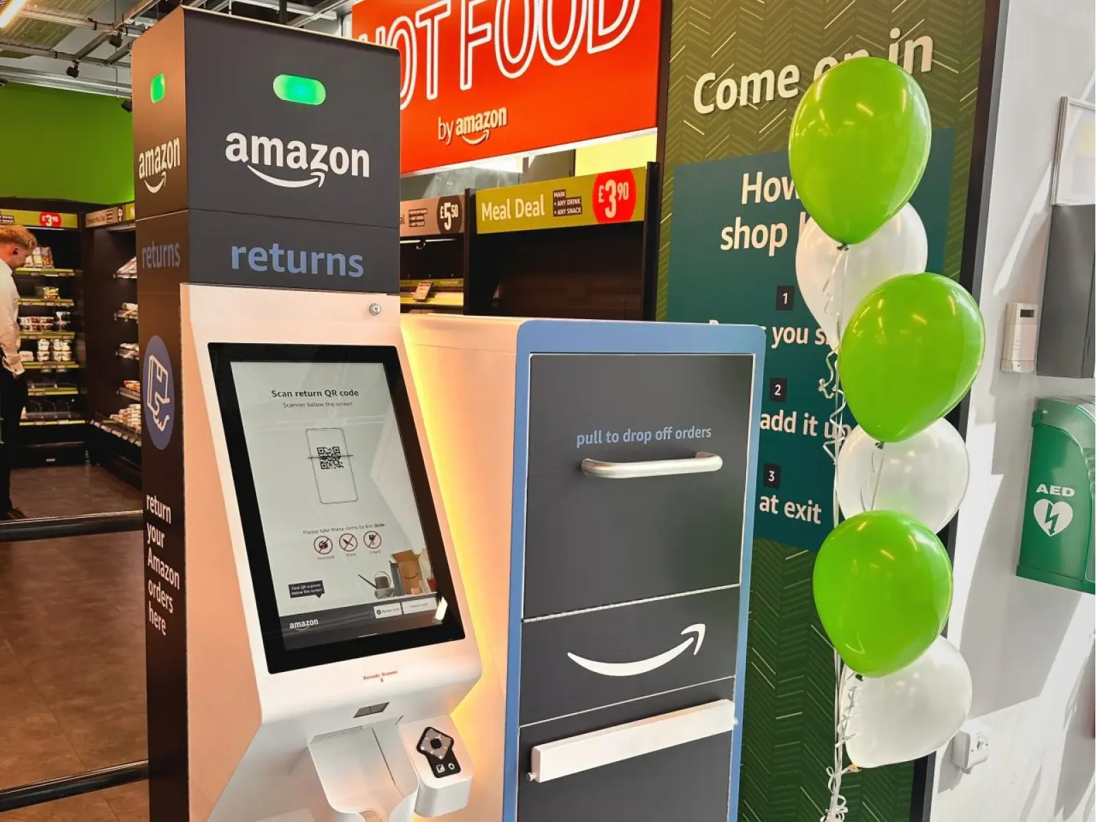
Onsite research showed customers spent up to 45 seconds looking for their QR code mid-flow, or for the scanner itself. Combining the home and scan screens removed a full step and made the scanner location explicit.
Warning messaging kept oversized, sharp and fragile items out of the kiosk before they could jam it, while a scan-success animation confirmed progress the moment customers needed reassurance.
Result → 25 fewer steps in 450 journeys
Decision 02 / 03
Multiple returns, without slowing the queue.
Some customers processed up to 20 orders in a single visit, restarting the journey each time while the queue grew. A dedicated multiple-return path let them chain QR codes in one session.
A dark theme signalled they were still in-flow, and animations were sped up throughout to keep the line moving.
Result → fewer repeat journeys, faster queues
Decision 03 / 03
Designed in the store, not the studio.
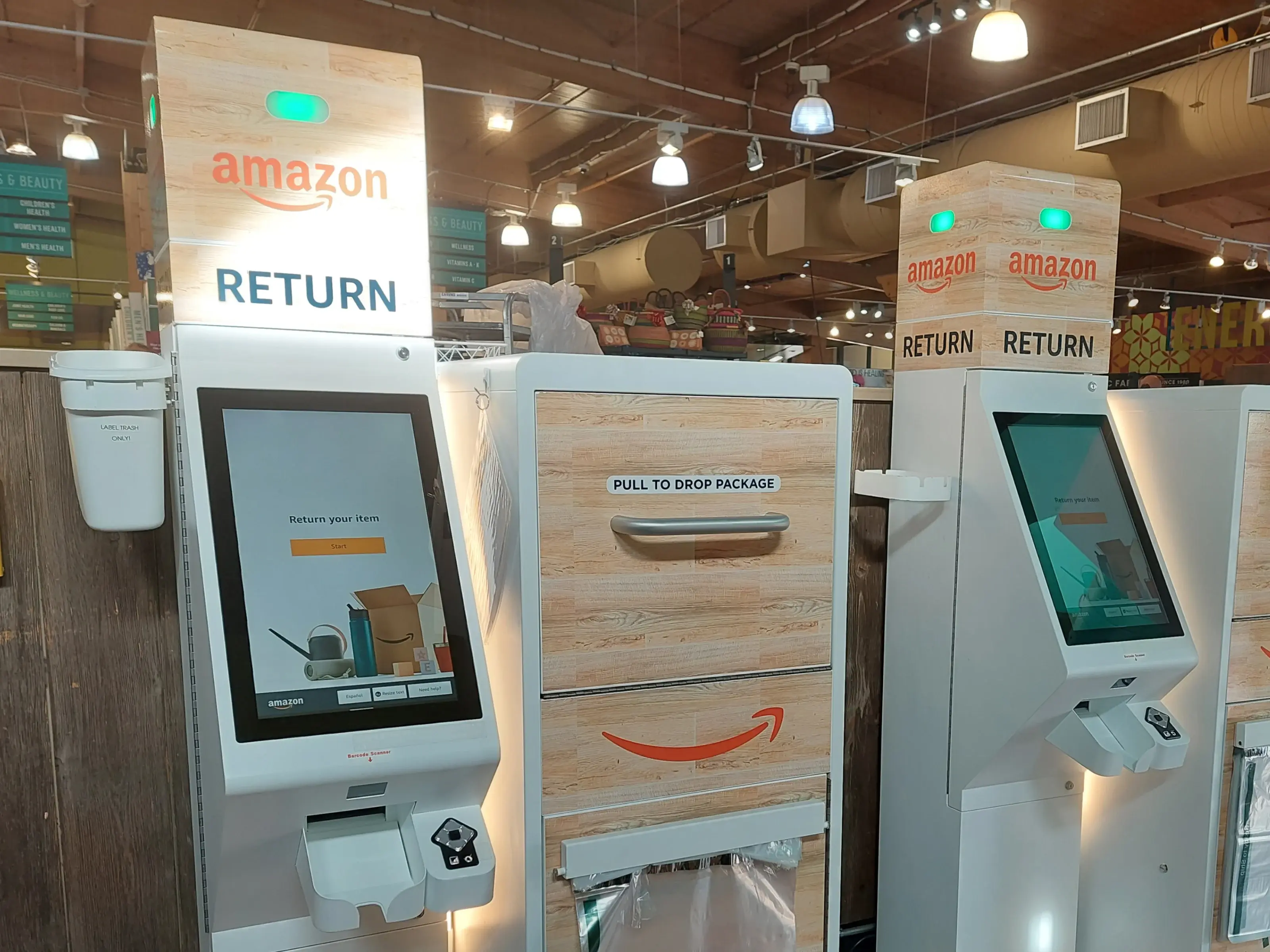
Drop-out data pointed at the screens, but the failures were physical: hidden scanners, jammed hatch doors, parcels that did not fit and staff workarounds. I validated against real kiosk hardware, observed handover with engineering and used store context to protect uptime as much as screen completion.
Result → increased kiosk uptime
The tradeoff
Balancing revenue pressure with the happy path.
One stakeholder group wanted a screensaver to drive revenue; another wanted to protect the core journey. The compromise was a QR code on the final screen linking to a discount voucher in the customer’s Amazon account wallet, increasing sales without touching happy-path completion.
Impact
What changed.
Journey time
90s → 56s
Drop-out rate
20.59% → 6.58%
Returns processed
40M in 3 years
Follow-on unit order
10x, $22.5M
Kiosk uptime
Increased
Store intervention
Reduced
Queue flow
Improved
Scanner confidence
Improved
Process
Research, design, prototyping and testing
Opportunity solution tree, data analysis, stakeholder interviews and staff surveys, user interviews and onsite field research, affinity mapping and value / effort matrix, flows, UI design, usability testing, development handoff and QA.
Next case study